 A Space for Thoughtful

Accessibility in Content Creation and Editorial Processes Explained
Summarize with:
As website content creators, we have the power to make our content readable worldwide. With approximately 27% of the U.S. population having a disability, it is essential to create content that meets web accessibility standards and is easily readable and perceivable.
Understanding the Web Content Accessibility Guidelines (WCAG) and creating content that adheres to them can be the first step toward accessibility. However, there are several other ways to ensure that your content is accessible to all, irrespective of disability.
In this article, we shall discuss why your content needs accessibility and the different digital accessibility tools and practices you can integrate for an inclusive editorial and content creation process.
Table of Contents:
- Why are Accessibility Guidelines Important for the Content Creation and Editorial Process?
- Impact of Web Typography on SEO
- Factors to Consider While Creating Responsive Typography
- Top 5 Ways to Integrate Web Accessibility Standards in the Content Creation and Editorial Process
- Final Thoughts
Why are Accessibility Guidelines Important for the Content Creation and Editorial Process?
Web content is accessed by millions of people globally, and with 16% of the world’s population suffering from a significant disability, it is important to cater to their needs. This practice can not only make your content reach a wider audience, it can save you from legal consequences.
The WCAG has made web accessibility standards mandatory for all companies, yet a significant number fail to adhere to its rules. These regulations must be clearly understood, and performing regular checks can be a great idea to start with accessibility content creation.
Impact of Web Typography on SEO
Web typography is the process of using different types of fonts when designing a website. It is key to improving SEO ranking, readability, and web accessibility.
The right font impacts your website’s ranking on search engines and makes reading effortless. It can improve your conversion and user experience in a way you cannot imagine.
Well-crafted web typography boosts visual hierarchy and smoothly guides users through the interface, reinforcing the brand identity.
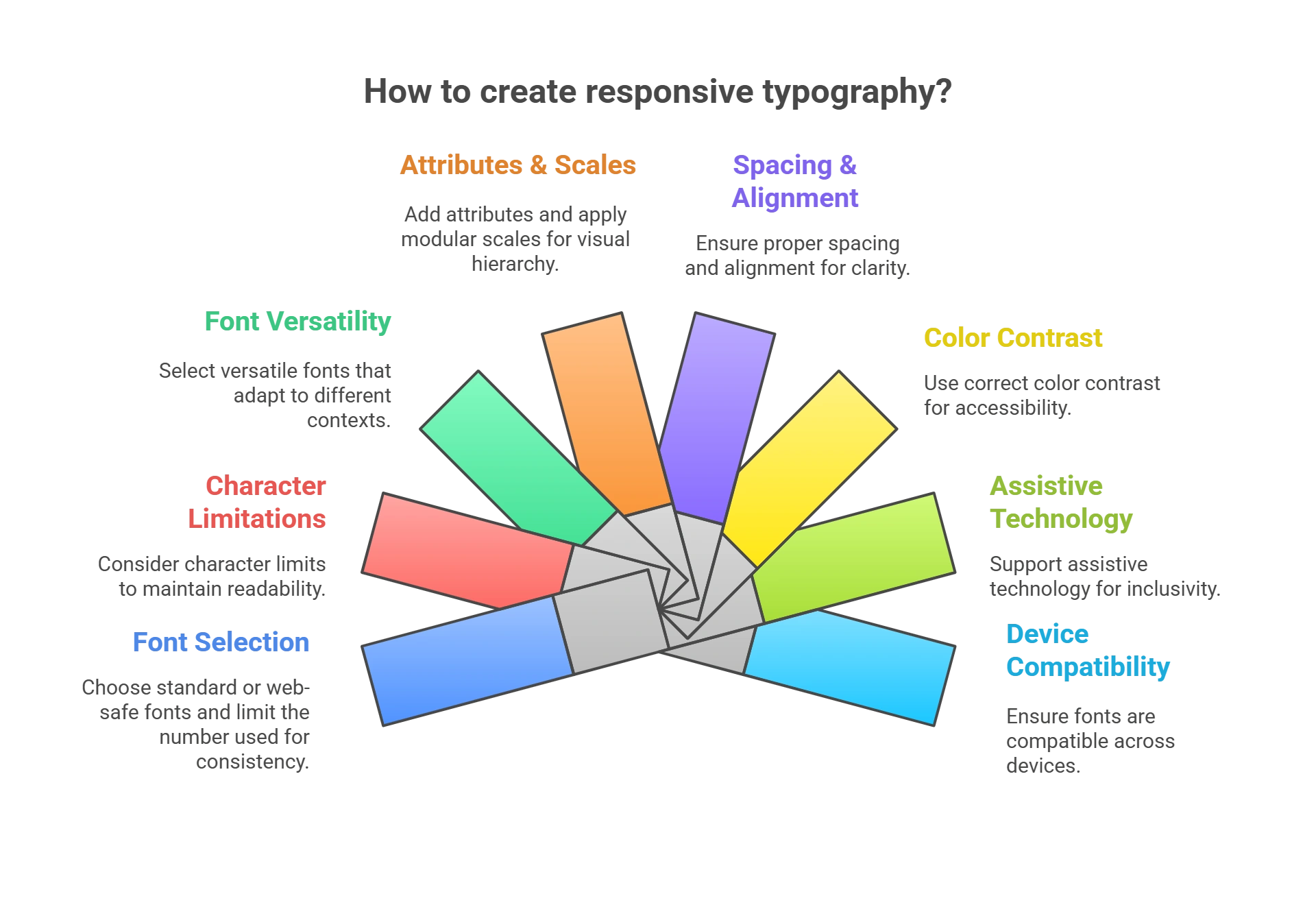
Factors to Consider While Creating Responsive Typography
Content that is created using typography best practices helps optimize the user interface and enhances user engagement. Here are some factors you need to consider while designing your web typography.:
1. Use Minimum Number of Fonts
Using too many types of fonts or font sizes may make your website look unprofessional and unstructured. Stick to one or a maximum of two font families throughout the website to avoid confusing your visitors.
Also, make sure that you are pairing the right ones together to make your content look appealing. Utilize this right pairing of web typography to create hierarchy and visual harmony. Use one font for the headlines and the complementary font for the text.
2. Use Standard or Web Safe Fonts
Try using a standard or system font to avoid distracting users from your website content. Flowery or curved fonts can sidetrack visitors from reading the text attentively.
Unless you want custom fonts for branding or your website content requires artistic web typography, adhere to system fonts. This ensures the readability of the text, so every visitor will be able to comprehend it.
3. Character Limitations
Ensure that your text is spread evenly throughout the website. Too congested or too spread out text tends to reduce user engagement.
Limiting characters on each line will enhance readability and web accessibility for the users. Using 60 characters per line ensures a good reading experience for desktops, while 30-40 characters per line work well for smartphones.
4. Select Versatile Fonts
Choose font styles that work in multiple sizes and weights. This guarantees readability for every screen size and resolution. Some styles are not mobile-friendly fonts. Though interesting and visually appealing, these become difficult to read on smaller screens.
5. Add Attributes
Attributes such as bold, italicized, capitals, or color help make text conspicuous and attract visitors to the website. However, balance is crucial, as using too many attributes for web typography will make it look cluttered.
Avoid using all capitals except when using acronyms or logos. Use capital letters for the first letter of the headlines.
6. Apply Modular Scales and Appropriate Font Size
Font size optimization plays a key role in improving the understandability and aesthetics of web content. Using appropriate font sizes ensures legibility and web accessibility.
Maintain the proper proportion of various text elements on your website using a modular scale. A modular scale is a series of font sizes based on a predetermined ratio that ensures a harmonious relationship of the text typographic elements.
7. Take Care of Spacing
Maintain proper spacing between the lines to enhance the readability of your content and viewer engagement. Increasing line height or spacing to about 30% more than the character height adds to legibility and helps understand the content better.
8. Alignment
Align web typography throughout the website in a similar pattern. This provides a uniform and organized look to your content. Proper alignment of images, charts, texts, and other components is visually appealing to visitors and improves comprehension and user engagement.
9. Correct Color Contrast
The most visually appealing component of any website is a color feature. Used appropriately, it can attract users to your website and help build brand recall.
The most basic and widely used color combination is the black text written on a white background. Nonetheless, you can custom design using any light and dark color combination as long as it looks interesting and enhances web accessibility.
Despite that, avoid using text in red or green, as green and red color blindness are the most common types of color blindness. Since color blindness is common, use other colors or cues to highlight important parts of the content and augment your site’s web accessibility.
10. Support Assistive Technology
Employing responsive typography that facilitates the use of screen readers or other assistive devices is ideal for users suffering from cognitive disabilities or visual impairments.
Usually, such users find it difficult to access the content due to their deficiencies. Designing your website keeping their needs in mind will improve web accessibility and impact user experience.
11. Relevancy of Font
Design user-friendly fonts with an eye on your brand identity. Different fonts represent different perceptions.
Sans-serif fonts offer a clean and modern appearance, while Serif fonts project authority and tradition. Create responsive web design in alignment with your brand’s tone to enhance viewership and user experience.
12. Device Compatibility
A laptop and a smartphone have entirely different screens. Appropriate font size optimization makes the text readable from different types of devices. Create fluid web typography using viewport units, which can easily gel with different screens.
Furthermore, if you are setting your content for mobile users, view it from mobile to determine whether it is suitable for a smartphone screen.
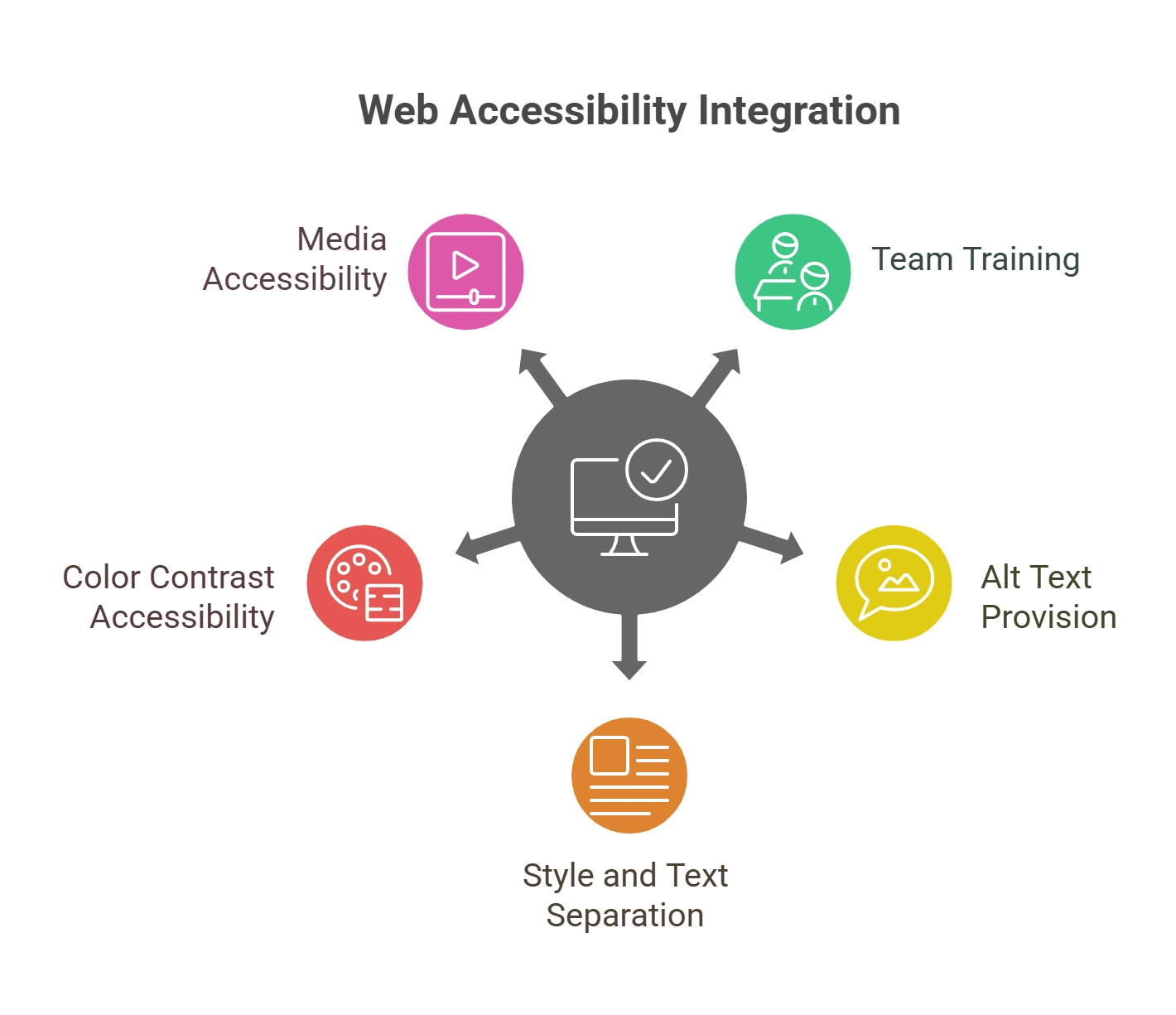
Top 5 Ways to Integrate Web Accessibility Standards in the Content Creation and Editorial Process
Here are the best practices you can include in your accessibility content creation strategy for enhanced readability for disabled individuals for inclusive website growth.
1. Train Your Team
The most important step towards accessibility is spreading awareness in your content team. It is crucial that your team recognizes the importance of web accessibility standards and works towards accomplishing them.
Provide training to your team with the help of workshops or meetings where you discuss web content accessibility in detail and give them a comprehensive view of it. Give them an idea of the different digital accessibility tools they can use for this and how the company can benefit from integrating this practice into their functioning.
Train them to use different checklists and pointers and to check for accessibility in the content that the company generates.
2. Provide Alt Text
Providing alternate text for visuals is key to user experience (UX) accessibility. This text tells webpage users with visual disabilities about the images, and they can be near or under these images.
Try to include images that add value to your content so that you can easily use alt text that adds value to readers. Use a clean font that people can read clearly, and avoid using redundant phrases like ‘picture of’ or ‘image of.’ Instead, focus on adding something concrete to adhere to web accessibility standards.
Use sentence periods and keep the description crisp and short for enhanced accessibility. It is essential to trace the meaning of the pictures and write alt texts accordingly for better understanding.
3. Separate Style and Text
When it comes to the editorial process, there must be an understanding that what you see on paper may not be what you see on the web. If you are a company that prints content, it is crucial to ensure that your content meets the editorial accessibility checklist.
If your laptop does not read the printed content well enough, it may be a sign that you need to modify your content. Content creators must separate style from text because not everything that looks readable font-wise will work for disabled users.
Look at content more closely and make sure you use makeup that is indeed clear for every reader to make your design more inclusive and not just ‘look’ like it meets web accessibility standards.
4. Color Contrast Accessibility
Color contrast is a significant factor in accessibility for all users. This user experience (UX) accessibility indicator is helpful for low-vision viewers who cannot see low-contrast pictures that well.
Adhering to the web accessibility standards for contrast can help them see the text clearly and increase your website’s retention rate. A 2:1 contrast rate for light grey text against a white background may not do well for low-vision viewers, as the text remains too light.
An optimum contrast rate of at least 4.5:1 is important for the body text on any webpage. Large fonts like headings and sub-headings can be around 3:1 as they are easier to view.
5. Links, Videos, and Tables
There are a few things to remember when creating accessibility content so you can give your readers a smooth and accessible reading journey. Use tables to make navigating through the text more comfortable for viewers. Before the table starts, write what it is about and how many rows and columns it will have.
Consider adding videos with captions under them to allow readers to understand how they relate to the web content. Adding caption descriptions can be a great way to adhere to web accessibility standards and enhance the viewing experience.
Focus on making links more accessible to readers by making the anchor text more descriptive. This way, readers know where the link will lead them and are not lost on its relevance to the content. Put links that open in the same tab and do not lead to a different tab so users do not have to switch tabs when navigating content.
Check out EXCLUSIVE: How to Create an Accessible Brand in 2024 and Beyond?
Final Thoughts
Adequate tools and practice can help craft an editorial and content creation process that is easy for disabled people to use and interpret. Creating an editorial accessibility checklist and ensuring your content follows that list can be a great starting point for creating web content that people with disabilities can read and understand.
To elevate your editorial and content creation process, consider using Hurix Digital‘s digital accessibility tools today. With our cutting-edge technology and highly functional tools, you can create a content strategy that keeps you ahead of the competition.
Contact Hurix Digital today to upgrade your online presence with inclusive content!
Summarize with:

Vice President – Content Transformation at HurixDigital, based in Chennai. With nearly 20 years in digital content, he leads large-scale transformation and accessibility initiatives. A frequent presenter (e.g., London Book Fair 2025), Gokulnath drives AI-powered publishing solutions and inclusive content strategies for global clients