 A Space for Thoughtful

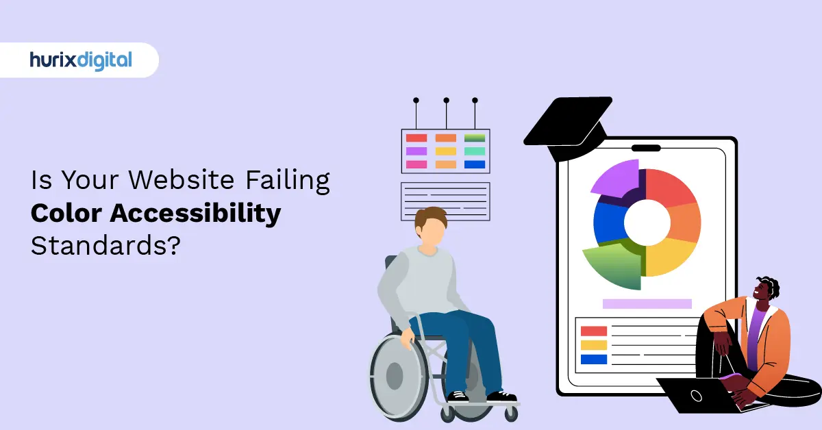
Is Your Website Failing Color Accessibility Standards?
Summarize with:
Imagine walking into a library where the books are printed in light grey ink on white paper. Frustrating, right? You’d probably squint, strain your eyes, and eventually give up.
Now, apply that same logic to the web.
For millions of users, the digital world often feels like that library. Whether it’s a lack of distinction between buttons and backgrounds or text that melts into the void, poor color choices are more than just a design faux pas. They are a barrier to entry.
This is where color accessibility steps in. The days of treating accessibility as an “optional add-on” or a “nice-to-have” feature are long gone. Today, inclusive design is the baseline. It is the standard. If your digital platform isn’t accessible, it isn’t finished.
In this deep dive, we’re going to explore everything you need to know about color accessibility. We’ll cover why it matters (for humans and for business), the nitty-gritty of WCAG compliance, and how you can choose a palette that looks stunning and welcomes everyone.
Table of Contents:
- What is Color Accessibility, Anyway?
- The Human Side: Who Are We Designing For?
- The Business Case: Why Inclusivity is a Growth Strategy
- Cracking the Code: WCAG Guidelines Explained
- Designing with Accessibility in Mind: Practical Tips
- Tools of the Trade: Validating Your Choices
- 8 Reasons Why Color Contrast is Non-Negotiable
- The Future of Color Accessibility
- Summing Up
What is Color Accessibility, Anyway?
At its core, color accessibility ensures that people with visual impairments or color vision deficiencies can perceive, navigate, and interact with your content just as effectively as anyone else.
It’s not just about picking colors that “pop.” It’s about contrast.
Color contrast refers to the degree of difference in hue, lightness, or saturation between two or more colors. It’s the visual “oomph” that separates your foreground (text) from your background (canvas). High contrast means the colors are distinct, like black ink on white paper. Low contrast means they blend, like yellow text on a white background.
When we talk about accessible design, we aren’t asking you to design in black and white. We are asking you to ensure that the difference between your elements is sufficient enough that someone with low vision, color blindness, or even someone just looking at their phone in bright sunlight, can read it without a headache.
The Contrast Ratio
Technical alert: You’ll hear the term “contrast ratio” thrown around a lot. This is a mathematical calculation of the relative brightness (luminance) of two colors.
- 1:1 Ratio: No contrast (white text on white background).
- 21:1 Ratio: Maximum contrast (black text on white background).
Your goal is to hit the sweet spots in between, defined by global standards like the Web Content Accessibility Guidelines (WCAG).
The Human Side: Who Are We Designing For?
It’s easy to get lost in the numbers: ratios, hex codes, compliance levels. But let’s pause and remember the people behind the screen. Color accessibility isn’t for algorithms; it’s for humans.
When you ignore color contrast, you aren’t just breaking a design rule; you are actively excluding huge groups of people.
1. The Color Blind Community
Did you know that approximately 4.5% of the global population experiences some form of color vision deficiency? That might sound like a small percentage, but in a room of 20 people, that’s likely one person who sees your website differently than you do.
For these users, distinguishing between red and green (the most common deficiency) can be impossible. If your error messages are just red text and your success messages are just green text, a color-blind user might not know if their transaction passed or failed.
High-contrast pairings ensure that even if the specific hue isn’t perceived, the content is still legible.
2. Users with Low Vision
This category is broad. It includes people with partial sight, tunnel vision, or age-related macular degeneration. As we age, our eyes naturally struggle more with light intake and focus. Seniors benefit immensely from sharp distinctions between text and background.
For someone with low vision, low-contrast text doesn’t just look “light”—it effectively disappears.
3. Individuals with Dyslexia
Accessibility often overlaps in surprising ways. For individuals with dyslexia, reading on a screen can already be a challenge, where letters seem to “swim.”
Sharp, clear color distinctions between background and text reduce visual confusion. It anchors the text, making it simpler to absorb and comprehend information without extra cognitive strain.
4. Photophobia (Light Sensitivity)
Have you ever had a migraine and looked at a bright screen? It hurts. Photophobia is a condition where a person is sensitive to light.
Using high-contrast designs, such as “Dark Mode” implementations with dark backgrounds and light (but not blindingly bright) text, can significantly reduce eye strain.
5. Situational Impairments
Here is the kicker: accessibility helps people who don’t identify as disabled, too.
- The Sunlight Scenario: You are outside, and the sun is glaring on your phone screen. A low-contrast design becomes invisible. A high-contrast design remains readable.
- The Dim Screen: You’re in battery-saver mode, and your screen brightness is at 10%. Can you still read that light grey footer text?
By designing for the margins, you improve the experience for the center.
The Business Case: Why Inclusivity is a Growth Strategy
If the human argument doesn’t sway your stakeholders, the business case certainly will. Accessibility solutions are no longer just a legal safety net; they are a competitive advantage.
Brand Reputation and Social Equity
Consumers these days are savvy. They support brands that align with their values. A business that prioritizes color accessibility sends a powerful message: “We welcome everyone.” It demonstrates a commitment to social equity and inclusivity. Conversely, an inaccessible site screams negligence.
Expanding Your Market Reach
Why leave money on the table? By ignoring accessibility, you are effectively locking the door on millions of potential customers with visual impairments. An accessible website is an open shop front for everyone.
Legal Compliance and Risk Mitigation
Governments globally have cracked down on digital exclusion. From the ADA in the US to the European Accessibility Act, the legal requirement is clear: digital spaces must be accessible. Ensuring your color palette is compliant isn’t just good design; it’s risk management.
Better Learning and Comprehension
For those in the EdTech space, like us at Hurix, this is critical. In education, color accessibility aids in comprehension. Imagine a textbook diagram where the color keys are indistinguishable. It renders the learning material useless. Clear contrast helps improve the learning experience for all students, ensuring that knowledge transfer isn’t blocked by a bad color palette.
Cracking the Code: WCAG Guidelines Explained
So, how do we actually measure this? We look to the Web Content Accessibility Guidelines (WCAG).
WCAG provides the benchmarks that legal bodies and design standards follow. When it comes to color, they have very specific rules to ensure text is legible.
The Magic Numbers: AA vs. AAA
WCAG classifies compliance into levels: A (minimum), AA (mid-range/standard), and AAA (gold standard). For most businesses, Level AA is the target.
Here is what you need to aim for:
1. Normal Text
- Standard: Level AA
- Requirement: Contrast ratio of at least 4.5:1.
- What this looks like: This covers your standard paragraph text (less than 18pt or 14pt bold). Think of standard black text on a white background (21:1) or dark blue on light grey.
2. Large Text
- Standard: Level AA
- Requirement: Contrast ratio of at least 3:1.
- What this looks like: Because larger text is easier to read, the contrast requirement is slightly more lenient. This applies to text that is 18pt and larger, or 14pt bold and larger.
3. User Interface (UI) Components
- Standard: Level AA
- Requirement: Contrast ratio of at least 3:1.
- What this looks like: This is crucial. It covers buttons, form input borders, and icons. If a user can’t see the “Submit” button, they can’t buy your product.
The Exceptions to the Rule
Are there times you can break these rules? Yes, but proceed with caution.
- Logotypes: Text that is part of a brand logo is exempt. You don’t need to redesign your company logo (though having an accessible version is smart!).
- Incidental Text: Text that is purely decorative and not meant to be read (like a random letter pattern in a background image) doesn’t need to pass.
- Disabled States: Inactive Buttons (greyed out) are currently exempt, though this is a contentious point in the UX community.
Designing with Accessibility in Mind: Practical Tips
Knowing the rules is one thing; applying them creatively is another. You don’t have to sacrifice beauty for utility. Here is how to create a palette that is both stunning and compliant.
1. Don’t Rely on Color Alone
This is the golden rule of accessible design. Never use color as the only visual cue to convey information.
- Bad Example: A form where errors are indicated only by turning the border red. (A color-blind user won’t see the red).
- Good Example: A form where errors turn the border red AND add an “X” icon AND add text that says “Error”.
2. Embrace Patterns and Textures
Charts and graphs are notorious for accessibility failures. Instead of just using a blue slice and a green slice in your pie chart, use a solid blue slice and a hatched green slice. Patterns add a second layer of distinction that doesn’t rely on color perception.
3. Mind Your “Invisibles”
Watch out for text over images. This is a design trend that refuses to die, but it is a nightmare for accessibility. Placing white text over a busy photograph often results in illegible contrast.
- The Fix: Use an overlay. Put a semi-transparent dark layer between the image and the text to force the contrast ratio up.
4. Test Early, Test Often
Don’t wait until the website is coded to check your colors. Accessibility should happen in the design phase (Figma, Sketch, Adobe XD). If you catch a contrast failure during the wireframe stage, it takes five minutes to fix. If you catch it after development, it takes days.
5. Context is King
Remember that text on a small mobile screen might require higher contrast than text on a massive 4k monitor. Glare, smudges, and viewing angles all reduce perceived contrast. Always aim slightly higher than the minimum requirement. If 4.5:1 is the pass mark, aim for 6:1.
Tools of the Trade: Validating Your Choices
You can’t eyeball contrast ratios. The human eye is subjective; the math is not. You need reliable tools to verify your work.
There are plenty of browser extensions out there, but you need something robust that gives you clear, actionable data.
Spotlight: Hurix’s Color Contrast Checker
At Hurix, we didn’t just want to talk about accessibility; we wanted to build solutions for it. That’s why we developed our own Color Contrast Checker.
Why use this tool?
- Instant Validation: Plug in your foreground and background hex codes and get an immediate Pass/Fail rating against WCAG 2.1 standards.
- Visual Simulation: It doesn’t just give you numbers; it helps you visualize how the combination looks.
- Future-Proofing: We keep our tools updated with the latest compliance guidelines.
Using a tool like this should be part of your daily workflow. Before you finalize that brand palette or approve that button color, run it through the checker. It takes seconds and saves you from potential legal headaches later.
8 Reasons Why Color Contrast is Non-Negotiable
To wrap up the “Why,” let’s consolidate the benefits. When you nail color accessibility, the ripple effects are massive:
- Readability: It makes content digestible for everyone, from teenagers to seniors.
- Hierarchy: Strong contrast naturally guides the eye. You can tell the difference between a Heading and a Paragraph instantly.
- Aesthetics: Believe it or not, accessible design is often cleaner design. It forces you to declutter and focus on clarity.
- Inclusivity: It opens your digital doors to people with disabilities.
- Color Blindness Support: It ensures 300 million+ people worldwide can actually use your interface.
- Better UX: A frustration-free experience leads to higher conversion rates.
- Legal Safety: It keeps the lawsuits away.
- Mental Well-being: Reduced eye strain means happier, less fatigued users.
The Future of Color Accessibility
As we look toward the latter half of the 2020s, we are seeing a shift. Tools are getting smarter. AI can now auto-suggest accessible palettes (though you should always verify them human-to-human). But the core principle remains unchanged: empathy.
We are moving towards a web that adapts to the user. We are seeing operating systems that allow users to override website colors with their own high-contrast preferences. Your job as a content creator or designer is to build products that are robust enough to handle these adaptations without breaking.
Designing for accessibility isn’t about restricting your creativity. It is about channeling your creativity into a format that can be experienced by the widest possible audience.
Summing Up
By prioritizing color accessibility in the design phase, we build digital environments that are welcoming to everybody. It’s about color combination awareness, sensitivity to color blindness, and a firm grasp of WCAG principles.
These actions render designs fit for everyone. Not only do compliant colors improve readability and enhance the user interface, but they also foster greater equity and give all users unrestricted entry to data.
A user-friendly approach requires consideration of usability for individuals with disabilities. Whether you’re a designer, a teacher, or just someone who loves the web, thinking about color accessibility is like giving a warm welcome to all visitors.
Don’t guess. Don’t assume. Test your colors, refine your palettes, and commit to inclusivity.
Ready to make your digital presence truly accessible? You can get in touch with Hurix Digital. We understand the nuance of accessibility standards and help businesses all around the world transform their content to be accessible to all.
Summarize with:

Vice President – Content Transformation at HurixDigital, based in Chennai. With nearly 20 years in digital content, he leads large-scale transformation and accessibility initiatives. A frequent presenter (e.g., London Book Fair 2025), Gokulnath drives AI-powered publishing solutions and inclusive content strategies for global clients